Behind the Scenes
How I made this site, spoiler…it was fun!
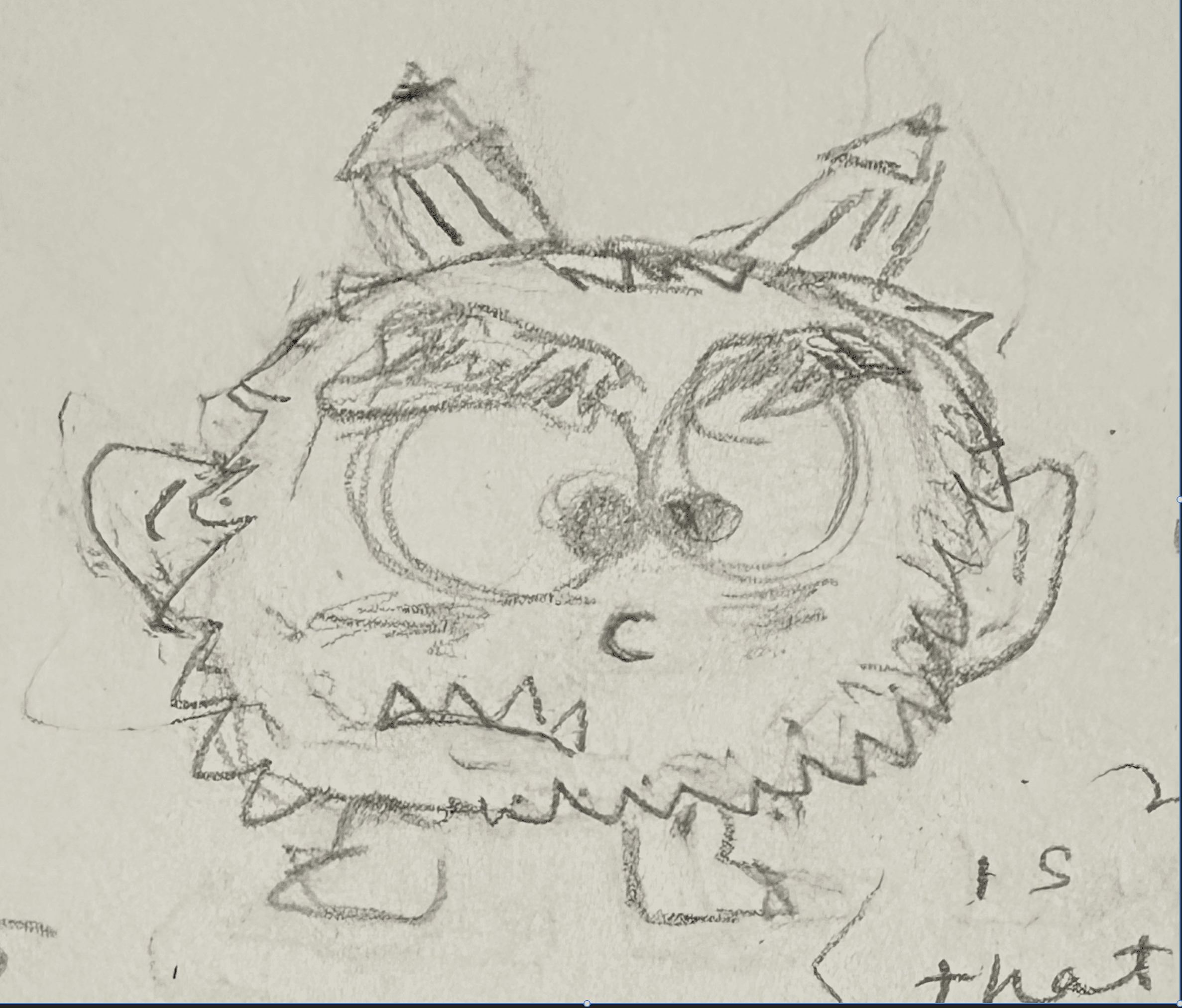
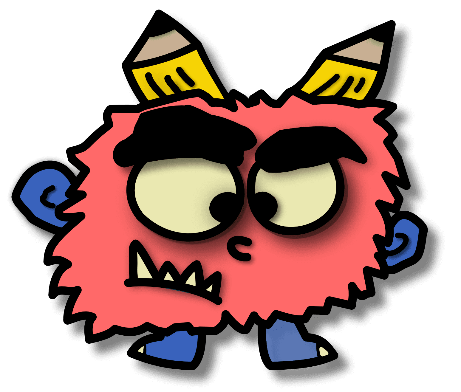
Meet Ugh, CJ's logo and alter ego. He tells them when stuff is misspelled, not lined up right, or just odd in general. He's a bit of a perfectionist.

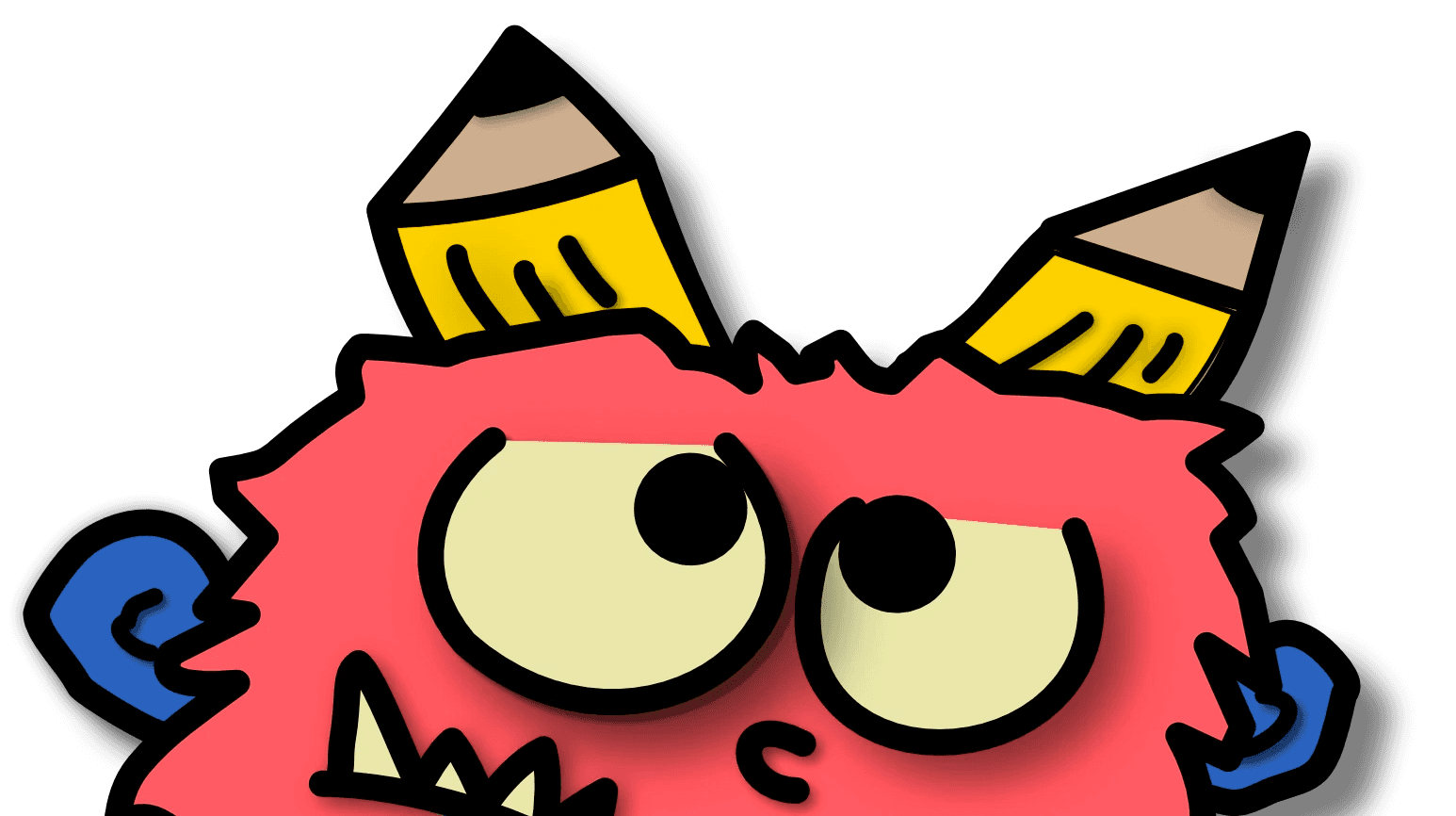
I sketched "Ugh" from scratch, making sure to capture personality in the eyes and eyebrows. I figured, because of his extreme attention to detail, his eyes are asymmetrical and his pupils have a wide range of movement. After sketching, I traced my logo in Affinity Design and was able to add various effects such as colors, shadows, animations, and etc.
"Ugh" is the summation of all my perfectionistic tendencies. My idea for this logo stems from my everlasting love of No. 2 Ticonderoga Pencils. One caveat of excessive pencil use is the eraser shavings that get everywhere. I was able to create a logo story comically relevant to my journey in design. We all have that voice in our head that helps us iterate and strive for better. "Ugh" is mine personified— a grumpy, opinionated clump of eraser shavings with pencil horns.
Logo Design
I wanted the header font to feel reminiscent of my pencil theme. Out of hundreds of handwritten options, I felt that Darumadrop One is one of the most readable fonts due to its utilization of capitalized letters and thick strokes. I believe it's important to troubleshoot and search for creative solutions versus sacrificing personality, because designs should always convey meaning to users.
Typography
apercu
For the body text, I decided to choose a Sans Serif font in efforts to prioritize readability. One example of incredible typography is "HeadSpace", an application dedicated to mental health. I saw the Apercu font featured in their brand guidelines—I love how it appears slightly narrow with less rounding in comparison to standard and geometric fonts. "Ugh" can't stand most geometric fonts like Monserrat, though Poppins is a bit better. He feels they're just too wide and lack neutrality—they give an awkward futuristic vibe.
"Darumadrop One"
My palette follows the colors of a pencil. Most erasers are typically pinkish orange. Because "Grumpy Pink" (Ugh's coloring) is fairly close to yellow, I chose "Captin' True", as my primary color. This offers the site more contrast and mimics the classic complimentary combo of blue and orange.
Color Palette
Captin' True
HEX #387CF2
Grumpy Pink
HEX #FF6969
Sharp #2
HEX #FDD100
HEX #F7FAE6
The Right Off-White
Back Home
I designed this website with you in mind. I know time is precious. Though you may want to take your time and browse around a bit, in reality you only have about 30 to 60 seconds to view projects. I leveraged components such as carousels, overlays, and hyperlinks to maximize your efficiency as you navigate throughout the site. Case in point—click the button below to revisit "Ugh" on the home page.
Website Design in Framer