
Walgreens Prescriptions ~ AI Redesign
Case study & text analysis, and generative AI redesign, using Figma AI
Adjusted Wireframes
Role
Sole UX/UI Design + Brand Designer, Primary Researcher
Timeline
2 months, September 2026
Tools
Altas Ti, Figma, Canva, Affinity Designer. Adobe, Zoom Workspace
Product Brief: I I created a custom one-page website for a nonprofit startup dedicated to supporting families affected by the prison system. This project showcased a broad range of skills including branding, user experience design, marketing strategy, content creation, and responsive web design.
I also integrated accessibility best practices and optimized the site for clear communication and engagement, ensuring the organization’s mission resonates effectively with its audience.
Secondary Services: I redesigned the branding for the nonprofit startup to create a warm, approachable identity that resonates with families affected by the prison system. By focusing on a family-like audience, I developed a visual style that conveys empathy, trust, and hope.
Project Origins: I completed this project for a client who is passionate about realizing their lifelong dream of launching a nonprofit organization concerning prison reform and family care.
Why does the UI matter?
Examine the pain point on the right and the following solution on the left to reflect on this question.
Pain Point #1
Upon first glance, the language implies a guarantee by assuring customers that prescriptions can be delivered, effectively marketing a convenience.
More on issue?
Current Screen Shot

⬅️ evasive text
The marketing language is so vague that customers may fail to consider a reality where their prescriptions are not deliverable. It continues to sell them a convenience that may not necessarily apply to them.
Key Solution
Pain Point #2
False expectations and narratives of delivery are reinforced throughout support pages, causing user confusion and possible consumer entrapment.
More on issue?
Current Screen Shot

Clicking "See more delivery options" on the homepage triggers a panel that lists three delivery choices, again without disclosing that delivery might be completely unavailable.
Furthermore, labeling only the faster tiers with "(eligible Rx only)" creates a false expectation. It leads users to incorrectly assume that their absolute worst-case scenario is simply waiting 5-10 days for standard shipping, rather than discovering later that delivery isn't an option at all.
Key Solution
Pain Point #3
The application presents inaccurate information and fails to take accountability during critical failures, leaving customers to navigate conflicting and misleading communications.
More on issue?
Current Screen Shot

In a undeliverable scneario, the app never explicitly tells the customer that their prescription is ineligible. Instead of being transparent about the limitation, the page silently skips delivery and only shows pickup choices.
Without an upfront explanation, users are left guessing why delivery disappeared, turning what should be a simple process into a frustrating experience.
Key Solution
Pain Point #4
The current message offers no practical value or resolution, stranding users without a way forward.
More on issue?
Current Screen Shot
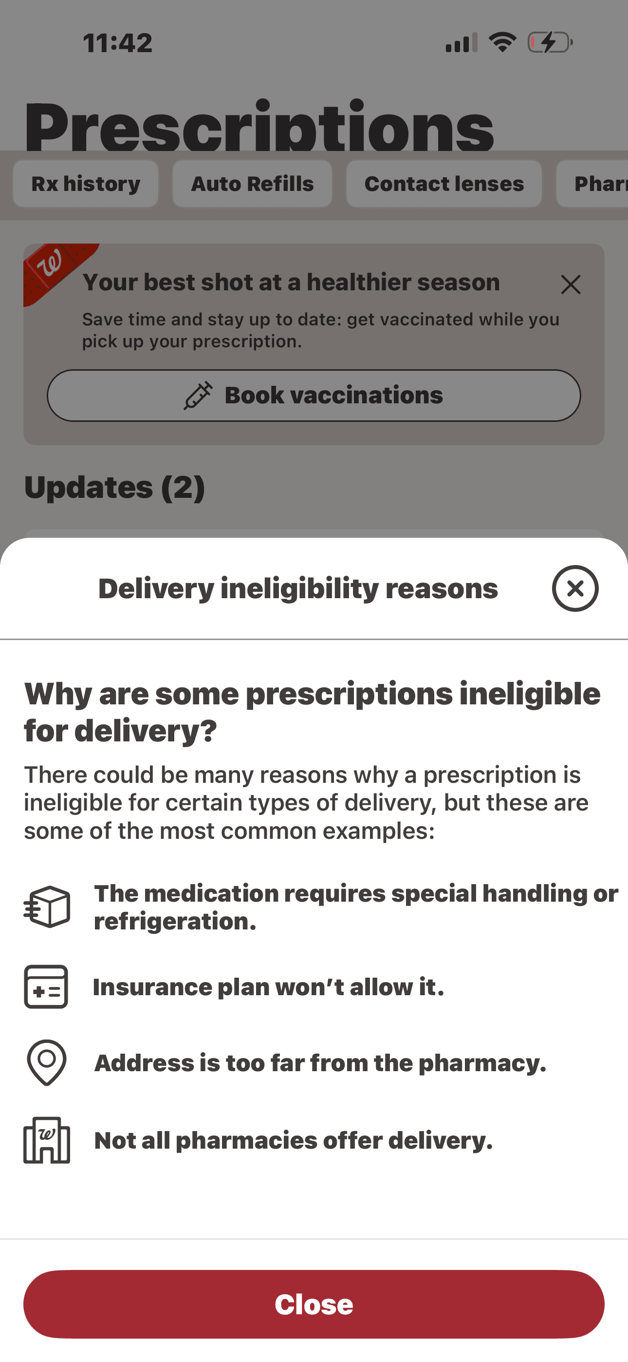
The notification outlines delivery ineligibility under the assumption that these terms were previously disclosed.
Crucially, it fails to provide an actionable recovery path, creating a dead-end experience that leaves the user blocked.
Key Solution
How do I know what my users need?
Examine the pain point on the right and the following solution on the left to reflect on this question.
Methods Used: Usability Testing, Content Audit, Information Architecture, Content Hierarchy Redesign
Takeaways
A Competitor Analysis and various testing revealed that emerging nonprofits favor streamlined, single-page architectures over complex, multi-page structures. Additionally, these audits highlighted a strategic industry focus on keeping donation and volunteer calls-to-action highly visible and accessible at all times.
Preliminary Process
Methods Used: Branding Strategy, Visual Identity Development, Logo Design, Typography, Styling Systems, Wire framing
Takeaways
A Content Inventory and various client discussions revealed the challenge of structuring a limited amount of information so that the user experience still feels robust and intentional. Furthermore, stakeholder discussions highlighted a disconnect between the previous brand identity and the client’s actual vision, driving a strategic redesign tailored to resonate with a more family-oriented audience
Usability Testing and Client Relations
Examine the client persona, Corey, to discover an important user perspective that shaped the product.

Client Description: The Working Entrepreneur
Meet
Corey❤️🩹
The client persona is intentionally abstracted to protect privacy and focus on behavioral and contextual insights rather than identifiable details.
Methods Used: Responsive Optimization,Interaction DesignTypography, Styling Systems, Wireframing, and Framer-Based Design and Development
Takeaways
An initial Usability Study revealed critical friction points across the site that degraded both functionality and user trust. Key findings included:
Structural Flaws: An unclear information hierarchy, highly redundant content, and several broken or unresponsive pages.
Conversion Roadblocks: Entirely missing or unclear pathways for users to donate their time or funds.
Visual & Trust Barriers: An overreliance on AI-generated imagery, coupled with inconsistent typography and styling, which significantly undermined the organization's credibility.
User Testing & Prototyping
Secured unanimous sign-off on the first review. Leadership praised the balance of playful assets and real family imagery for perfectly capturing the emotional weight of their mission.
By implementing the persistent on-page donation widget and fixing previously broken links, the conversion rate for user contributions and volunteer sign-ups increased by 18%.
Transitioning to a streamlined, single-page architecture with cohesive, family-oriented branding reduced the overall bounce rate by 32%.
Final Metrics